Tuesday 21 December 2010

On Men and Gods @ La Louvre


Great public galleries have a tendency to overwhelm in an a curious and inbuilt tension that pulls at odds against their purpose. The scale of the space and stone is formidable and all those cold panes of glass between paint and person or the shin high cordons that forbid us from the space around a work suggest us that, at best, we're unwelcome at worst a threat to the object itself. The tension is often most damaging to the greatest works, with all that security and all those other pictures we feel embarrassed to linger too long, lest we miss something else or fail to gaze with sufficient reverence. Well meaning galleries over-compensate by flooding the halls with themes and interpretations. It's a shame as it's just another obstacle between you and me and the painted image, those great and universal public assets that we all deserve to see.
No art museum comes with a more powerful than the reformed palace of the Louvre.


Anywhere that holds the exquisite secular relic and global celebrity the Mona Lisa can't help but change our relationship to the building and the other objects in it. However it might just be that the sheer disproportionate volume of Leonardo's small work makes space and time for all sorts of other works. The Mona Lisa is a magnet for clamour and clatter (to the extent that I'm not going to even pretend to have really seen it in any meaningful way) but that noise has a sweet reverberation, it let's us linger, engage and indulge in front of La Joconde's Italian neighbours.


The stretch of the Louvre that shows Italian painters soar in what we now call the Renaissance has an oddly matter of fact brilliance. You walk through the high walls and wide corridors and again and again find something breathtaking. The lack of pomp for the vast majority of works is a great leveller, it makes them easier to see as paintings rather than price-tags or treasures. The comparison with what is happening in the works instructive for repeatedly we see artists take the sacred, awesome and ineffable and render it in human terms. The abundance of Christian imagery, the cast of now largely obscure saints and barely half familiar situations is Christianity can be a barrier to viewers today. The sense that special knowledge is needed to interpret painting has been promoted by historians and critics, whilst mainstream Christian imagery has become simpler, focussing on a benevolent Christ figure and the idea of personal salvation. Italian painting of the fifteenth and sixteenth belies this. There is a breadth of situation, character and imagery but the efforts of the artists to couch these in universal, if often extreme, experience makes access easy. It's just a question of looking.


Fra Angelico's massive altarpiece, 'The Coronation of The Virgin' is awash in gold and blue. The stepped construction, building up to Mary crowned by Christ, brings the eye upward but the first step brings us on to a familiar scene. A crowd is assembled, ostensibly made up of Saints, to bear witness to the coronation. On the bottom right two women (St Catherine with the wheel on which she is broken and St Agnes with her eponymous lamb) look on. More accurately the two women seem to share a confidence or remark on the scene. Whichever is the case it doesn't matter, in that small gesture Fran Angelico opens up the work to us, in giving two characters such an understated and quiet moment he has changed the scene. The moment of veneration is linked to private quiet contemplation and as that happens the scale shifts to one we can understand.


An innate quality of Christianity is the way, primarily using the figure of Christ, it negotiates the metaphysical questions that nag at sentient humans. Where art is at its best it considers, or aids in the consideration of similar questions: what it is to be conscious, how we can understand others or how we face our own mortality. Christianity does this through analogy even if we strip it of supernatural content. Art still looks for those analogies in colour and form but it is during the Renaissance when, in the service of Catholic patrons, artists attempted to evoke empathy through pictorial realism to explore those questions more directly. This evocative and empathetic approach is not necessarily the same as outright pictorial realism, even though many images from the period are uncannily photographic, but it does seek to create recognisable images that are more than totems. It lets us look at fiction and see ourselves.


Andrea Mantegna painted figures in sometimes strained perspectives that don't always work on paper or screen. His figures get described as 'sculptural' but of that's the case it's a rough and wise marble that forms such recognisably human figures. Standing below 'Saint Sebastian' it makes perfect sense, it's sculptural because a man is tied to the ruins of classical column. There are two faces that make all the points you need. Arrow pierced Sebastian looks to the sky, whilst his torso is classically perfect his lips are thin, pained and his eyes scared. That look is not just one of beatific resignation but it stumbles too with doubt and hopelessness. Look down again, to our level and the tanned and leathery archer feels fear too, confusion and disbelief make him turn and look for affirmation, for anything. The archer figure helps make us complicit and his confusion lifts him above a pantomime villain. This Sebastian can pulse with meaning for us because it isn't about the superhuman it's about the all too fallible. Doubt and fear capture us and Mantegna meticulously captures the familiar shock of unknowing.


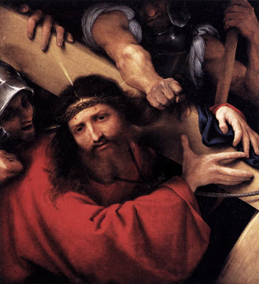
'The Death of the Virgin' has less of the wizened muscular Roman lowlifes that make Caravaggio look like modern moody social realism but instead it creates a very intimate theatre. It's tall, and when you look up you realise that virtually nothing happens in almost the whol top half. Instead of action there is a blackness and the scarlet folds of a curtain, draped and hanging as a canopy over the scene below. Beneath this coagulated sky a study in the shapes and shades of bloody grief plays out around a stone white corpse in a red dress. Mary lies lifeless and next to her the Magdalen is folded and almost limp with grief. The static paint almost twitches with loss but without histrionics. The faceless figure in the corner provides an actor for us to cast as ourselves, without the mugging of the other characters it's easier for us to imagine the confused ache of grieving. That's perhaps when we look up again, and the swirl of red fabric feels like inchoate rage at the sudden absence of a life.


There might be a creative tension at work throughout the Renaissance, that between a supernatural God and the growing cult of the individual. Another way to look at it is that understanding the role of religion in helping us give form and substance to our own existential crises. This isn't a religion of assured personal salvation but simply one of people reaching out to one another through pigment in the dark and finding the empathic power of art. That's not to say that the work here is automatically transcendent or improving, but when we see the hesitance in the face of Bellini's virgin as she realises her son is bound for death we have the opportunity to reach out for others too. Whether mirrors or lenses the great works here are all full of doubt and frailty and fallibility and nothing could be more human.

Monday 20 December 2010

On Nancy Spero @ Centre Pompidou


You can come to the work of Nancy Spero, shown here at Paris's Centre Pompidou in a posthumous retrospective with all sorts of biographical and ideological preconceptions. It's an enormous credit to an artist so easily identified with the pop-art, feminism, ant-war protest and all sorts of counter cultural reference that the visual and physical presence of Spero's work can stand outside and above the biography, theory and reportage and leave one quivering.


The work here spans almost fifty years, from dark washes of ink on paper in the late 1950's to encyclopaedic serigraphs created prior to Spero's death in 2009. There's a range of work here, mainly on paper, here spanning drawings, watercolours and prints, surrealism, abstraction, classical quotation, graphical and typography but throughout it is positively charged with a recognisable and common energy of line and colour. Everywhere you see the way that marks seem to have been made on the paper, in a kinetic blur or a with a slap of pigment but with an urgent assertion. It's this visual energy that makes Spero's urgent commitment far more than a lecture in ink and paint.


The earliest works here are dark monochrome smears, where people and words emerge in dark from an off white paper. In small drawings the figures might be the marks of features on a shroud or shadows seared into the walls of Pompeii. With a minimum of ink these lithographs look like memories, the men or women are isolated shapes on the paper that have been reduced down to the characteristics of totems. Across the same room and within four years the dark ink has filled the frame and figures seem to contort out of black smoke almost in the shapes of Blake's Job. Whether having figures pushing out of smoggy backgrounds or using a minimum of marks on the blank paper the common Spero characteristic is economy. Less happens than you might think, she just seems to make every stroke matter.


Part of the brilliance of this show is that is demonstrates how Spero takes on new stimulus, the media coverage of the Vietnam war or the poetry of Antonin Artaud, without ever losing her essential visual signature. The war pictures bring in harsh arbitrary shapes like the cross blades of the helicopter and we see human figures chewed and stripped to the bone, smeared with violent colour. People are tossed and ripped as if in rough Guernicas, twisted from the inside out and left motionless on piss-yellow washed backgrounds. Spero shows figures as if they were broken toy soldiers or the faceless repeated victims of conquest on triumphal Egyptian wall paintings. As she brings in these influences her economy of mark remains and adds to the impact of the paintings, the restraint prevents her from making war the spectacle that she abhors.


The war paintings also include explosive surrealist portraits of single figures that can remind you of Francis Bacon's contortions of Louise Bourgeois's genital surreality. Here Spero creates figures that might be Sumerian or Inca, disembodies heads that turn into sexual organs. Mouths spew blood and colour slashes and swirls and the overall effect are a series of aborted angels of death. Oddly at the end they remind you of Goya more than Spero's contemporaries. To be honest these pieces are far more effective than the text based works here. Slogans, no matter how you cut them up, lack the depth of great art. It's in these pieces is the most obviously a 'political' artist but they have the least ability to make us re-evaluate how we feel or to challenge us to action. The problem is a common one, politically motivated art tends to repeat a dogma and in doing so it loses the ability to connect in a human way.


The biggest work here, wrapped in three lines of large prints around three walls,'Azur', is a delirious archaeological montage. The individual images are like photocopies of artefacts, changing and degrading or the charcoal rubbings made of medieval funereal brasses, immediately they look like obsessive replication. But the lines of prints start to look like a fast cinematic montage and the juxtapositions and repetitions ask a question for every one they answer. It's not exactly analytical, but it looks like messy unresolved thought, the mind using images to wrestle with an idea. Intentionally or not they bring to mind patchwork quilts as much as radical collage. The colours are flashes almost like filters and throughout it is as if Spero has been playing with the combinations that visual culture offers us, cheesecake women come in cold blues while ancient sculpture pulses in technicolour. The persistence of the technique reminds us of its craft just as the quilt does, but it also suggests that nothing is fixed, that re-evaluation is an imperative and that we must question and question and question what we see.


The repeated printed image makes for visual poetry and punnery too. In 'Relay' Spero takes a classical Greek image of a woman running and repeats it, inverts it, reverses it, overlays it with colour and scratching and swathing it with colour. The effect (reminding us of the circularity of painting around a vase) is something both glorious and futile. This woman crosses colour and time, passing on something without ever reaching a finishing line. Ambiguity gives the piece depth but also helps show us how Spero's wok can be committed and ideological whilst still retaining an essential humanity and empathy. The answer to centuries of women not controlling the representation of their own image is for women to ceaselessly make images, not to simply state the issue and sit back in ideological smugness. Thats sense of vital imperative makes these works feel essential and timely.


Certain pieces of art come loaded with layers of reference, historical borrowings that weigh down the work and put the viewer in their place. It is as if we are being told "If you understand all of these things you might just be worthy to pass judgement on me". Others works tap into the vein of memory that pulses through our culture using the images that transmit and translate our shared experience, letting them bring their deep currents and seismic presence without hectoring the viewer with erudition. Spero's best work (and that's most of it_ transcends agit-prop and simple conceptual posturing. Wit and anger and movement and ambiguity make these works personally political and implicate the viewer. Feminism in art needs urgent powerful voices but too often gender studies ideology breeds sterile jargon (as does any ideology) and forgets that blood and skin and breath and tears and doubt and death are universal and that great art starts with there. Nancy Spero knew that and it's that heartbeat that survives her so wonderfully.

Friday 10 December 2010

On Annie Leibovitz: A Photographer's Life @ MCA


There can be something unintentionally hilarious about a retrospective show. The museum or gallery bestows its aura upon an artist whose body of work is brought together with hushed thematic reverence. But then, when we see it all together the volume and repetition poke us in the ribs and remind us that it isn't very good at all. Actually, it's a bit ridiculous. Well this is what's happening at Sydney's MCA with the international touring show 'Annie Leibovitz: A Photographer's Life'. Across the space of the museum's third floor we're reminded that there's nothing as funny as that pompous middlebrow middle-ground where art, celebrity and advertising meet in a smug vacuum.


There isn't that much of Leibovitz's big set piece baroque fantasies here. The tone is serious, at least in a kind of 'look at me I'm being serious' way. There is some of the lush art direction that has sucked in the stylistic traits of the perfume and couture advertisers that these pictures appear alongside but that's mainly confined to a single room. Instead there's a more or less chronological run through 15 years of sombre yet portentous portraiture, family snapshots and massive overblown landscapes. The chronological hang is a very mixed blessing. It gives a narrative strand to the photographer's family photos but it also means that early on you walk into a room and are struck by how massively derivative so much of the work is. So when she's with dancers on a beach you see Herb Ritts, big landscapes are photocopies of Ansel Adams, photos of US Olympians could have been taken by Leni Riefenstahl and art and grit intrudes with impersonations of Nan Goldin.


There is a candy-like feel to a lot of this work. There is undeniable pleasure as Queen Elizabeth look like she's more 'Lord of The Rings' than 'Monarch of the Glen', The White Stripes get all the kooky bohemian signifiers as the circus and 'A Clockwork Orange' intersect and Cindy Crawford is a gorgeously fleshy Cranach. But you can't help thinking that it's not very good for you, that all those layers of visual sugar don't actually add any depth. The more you look the shallower it gets and the more you realise each hint of insight and intelligence is a stylistic trope a signpost for 'clever', 'smart' or 'deep' that never takes you to the place itself.


There's an awful lot of cant talked about how Leibovitz captures her some essential humanity in her work better than some other portrait photographers. It's a claim I find curious. Repeatedly you see in these images the trademarks of a flattened depth of field and an almost hyper-real colour saturation, it's a striking signature and an effect that breaks many portrait conventions. However it also has a distancing effect the image is an Annie Leibovitz style portrait ,with all its ticks and tricks rather than some window onto the soul. Where there is a depth it's in the layers of irony, intended and otherwise, that attend each of the celebrity portraits. The notion that celebrities (whether models, artists, actors or politicians) are somehow closed books who the photographer opens with an insightful lens is pretty flawed. For some years the trajectory of celebrity image making has shot toward a place where flaws are as much a currency as glamour was in pre-war Hollywood. The majority these set-piece shots aren't stars stripped of their varnish with some naked candour, they're just as contrived as the airbrushed perfection of Hollywood gone by, but this time they're in the modern celebrity idiom of therapy culture, where a flaw or two gives a gives perspective to our true fabulousness.


Just like Hollywood stars hamming it in arthouse vanity cameos Leibovitz appropriates some of the signifiers of 'Art' here. It feels like an attempt to claim the spurious gravitas necessary to justify museum wallspace (assuming that celebrity pulling power on its own isn't enough). This the enlargements of these prints are messy at the edges, suggesting the sweat and toil of the atelier. Most strikingly the landscapes are massive wall sized slabs of black and white. Massive art need to be questioned for its motives. Scale has a pummeling effect on the viewer, it thunders self-importance and for that very reason it demands greater scrutiny. In this case the size of the images shouts louder than the content, the essential message is "I must be important art, because YOU can't print anything this big!"


Death and personal suffering have a tendency to neutralize objective criticism. The chronological seam of the show is sown with the thread of Leibovitz's relationship with her lover Susan Sontag, finishing in her decline and death. Biographically I have no doubt that it's interesting but artistically it feels like little more than a scrapbook. Formally most are presented as black and white snaps, some are quite beautiful, others quite mundane. Either way one cannot help wonder whether they would be of any intrinsic interest if they didn't have Sontag as their subject. The final image, and the one that sticks, is of Sontag's dead body laid out. It is composed of printed a number of frames that have been patched together, at once there's a touch of polyptych, death mask and tomb sculpture.


The Sontag photographs highlight a wider problem here. Plenty of minor artists have documented the the lives of titans, but they remain footnotes in the histories. Leibovitz works in and around the public culture of celebrity and on the edge of another culture of America's public intellectuals, I'm sure it makes for a great dinner party but it doesn't make her an artist of any significance. What you get instead is a kind of middlebrow paparazzi effect where a profusion of 'serious' (let's assume that taking oneself very seriously like the profusion of method actors here suffices to deserve that description) contemporary cultural figures lend some kind of minor cachet and allow viewers to tick a list of the recognisable great and good.


It's dangerous to equate artistic merit to subject matter, that's a criteria for photojournalism, but the single most striking image of the show is one of shocking reportage. 'Traces of the massacre of Tutsi schoolchildren and villagers on a bathroom wall, Shangi Mission School Rwanda' is as brutally sad as it is simple. The smears of bloodies hand prints, red caking into brown, hint at something almost unimaginable. The flatness and colour saturation work here. The yellow walls have a crime scene starkness and the lack of context is disorienting. The crop of the picture leaves you wondering is you see a wall or a floor or what the sheer amount of blood must mean, the lack of compass is a perfect visceral response to horror.


Perhaps it's the celebrity thing. The fact that I just don't care how well she's caught people acting out a public image. But there's also a feeling that Leibovitz is a celebrity photographer who photographs celebrities and if she wasn't this work wouldn't be be here. Other people's oddly cropped holiday snaps wouldn't merit hanging on a gallery wall nor would a series of derivative student-like experiments in art photohgraphy. Which makes me question which value system the gallery has bought into by staging the exhibition (although the fifteen dollar entrance fee pretty much answers that question for me). It's shame something so glossy and dumb should take up so much space and time in one of Sydney's few large scale art fora. You can call me snob but I really need something more than a middlebrow 'Where's Wally?' from the MCA.

Saturday 13 November 2010

Dagmar Cyrulla @ James Makin Gallery


Dagmar Cyrulla’s paintings, showing at Melbourne's James Makin Gallery, seem to bear witness to humanity at its most characteristically vulnerable. It’s entirely fitting that, when we look at her quiet suburban narratives we wonder: about what has occurred; what might be about to happen; what we should feel for the protagonists. She captures that most essential element of the human condition. Doubt.

We humans are uncertain of our futures, about one another’s motives and about whether seeing really is believing. Cyrulla’s paintings are sometimes fragile strokes that try to piece together things we can’t understand, her brushstrokes are the like the smear of recall, the half remembered last whereabouts of the victim. At times they feel like crime scene reconstructions, at others they are memories of the moment just before we couldn’t go back. Then again the works might also be dispassionate reportage on the banalities of every day life. That uncertainty of intent makes them compelling.

These paintings feature adults and children reduced to their essentials. Clothes give little away, décor is functional, props are rarely more than vases of flowers. Yet amongst this a hand might be about to form a plea or a fist, a wet red smear of lip might be smiling and from that gesture alone the whole canvass is imbued with a sense of import. Cyrulla shows action and reaction rather than cause and effect, in doing so she presents characters whose own existential crises remain hidden. That alone engages us with the paintings in a powerful way, we look at the human and project our own experience. These are ambiguous scenes depicted ambiguously, they sometimes feel illicit, often powerfully sexual, but again and again those responses are magnified because of our own uncertainty. Most of the action in these paintings takes place in our own minds, which is why they are so very memorable.

Ambiguity keeps Cyrulla on the right side of voyeurism. We may be watching a woman dressing after an afternoon tryst with a lover, or we might not. If the circumstances were more explicit we would be plunged into judgement. Instead the uncertainty reminds us of the frailty of human experience, of the difficulty of our own decisions and desires. Cyrulla manages to give us a tender distance that manages to retain both complexity and emotion.

At first sight Cyrulla’s painting brings to mind the work of Eric Fischl, the American artist whose suburbs and hotel rooms present a sleazier voyeuristic update of Edward Hopper. The comparison falls when you see the amount of cultural baggage Fischl loads his paintings with, they are much closer to a closed meaning that the work here. If Fischl’s work has a writerly analogue it’s Bret Easton-Ellis if Cyrulla does it’s Raymond Carver. The moment captured in Cyrulla’s work often hangs like a non-sequitur and it’s no surprise that she evokes literary precedents. There’s something of the spareness of Carver in there, her economy of palate reminds one of his sentences. There’s no rush to sneer or judge as people are on the verge of the banal, the cruel or the mistaken. The careful and considered tonal palate stops things straying into sensationalism. It’s a rare thing in any art form to present humanity without the hysteria, a rare and worthy thing.

It is easier to be reminded of Degas precision in framing meaning or the tender colour blocks of Bonnard’s obsessive repainting of his wife as she bathed. In both cases, as with Cyrulla, the impression left is far stronger than the specifics recorded on the canvass. Cyrulla’s hidden eyes, smudged skin and mid-air gestures show rather than tell, this makes the work powerful as it invites rather than dictates response. In terms of art criticism both Degas and Bonnard tend to be noted for their formal qualities, but for the general viewer their popularity comes from a link between that and their human content. Like both of these Cyrulla captures the fleshiness and the ineffable spirit of the human through a style that favours impression over precision. We look at her paintings and feel them, as we see she understands that we are all messy, imprecise, flawed creatures in search of meaning and respect.

The characters in the paintings inhabit unsettling psychic environments. Doors and windows feature heavily with all their intimations of parting and arrival, voyeurism and display. The interiors are not overly symbolic or detailed, they take on character through colour. Kitchens are reduced to tobacco wood smears and carpets swirl dizzily beneath our feet. Showhome interiors become faintly nauseous with touches of green and yellow so that sometimes the events might be taking place underwater, with all the struggle and inevitability of drowning.

It’s erroneous to imagine that dramas are always played out in the shadows in a land of vast blue skies, the cruel light of day bears witness to as many pivotal moments. Cyrulla’s use of light can be shocking, the harsh whitening blues of the summer sun make her feel a very Australian painter. It is also the naturalism, and often softness, of the light that adds emotional depth to the paintings, they create real spaces rather than noirish film sets.

Cyrulla’s characters retain the dignity of mystery. They are not painted to the point of photo-realism nor are they loaded up with cultural signifiers that signpost a particular lifestyle. The wonder and danger of painting is that it can tell us too much about its subject, a problem that often pushes contemporary narrative painting into kitsch. The painter here understands that it is precisely our inability to know one another that fascinates, that the fact that we rarely give out our all to the world is the essence of human drama. There is something respectful in the way that Cyrulla handles characters by showing us only their essentials she allows them to keep hold of themselves.

The best art will always find a relationship between form, what’s on the canvass, and narrative, what’s in our minds. Dagmar Cyrulla paints profound things with a restraint that we can all recognise. It’s the restraint of survival and coping, of getting on with it, of human beings living. In these paintings Cyrulla has created something touching and universal.


Thursday 21 October 2010

On David to Cézanne @ AGNSW


Drawing is the genesis, the connective tissue and the human hand most clearly present in art. The naked line and the smear of graphite link us most closely to out prehistoric cave marking ancestors. Drawing is like song, it is primal and familiar even when it is sophisticated or novel. It's no wonder that we react so strongly to it. It is an expression of pure being, the visual manifestation of thought onto a surface, drawing is more like language than art. 'David to Cézanne' at the AGNSW, a collection of French nineteenth century drawings, takes an interesting period of mark making and makes it seem wholly new. The bookends of the period are the icy neo-classicism of David and the over-familiar world of later Impressionism. It strikes me that both have audience problems. David, Ingres and Delacroix trouble us, the scale and sheer painterly virtuosity seem strange to our eye today, whilst Cézanne, Monet and Degas are as familiar as our family's faces despite being part of the most radical artistic rupture of the last two hundred years (I would argue that the schisms of Abstraction, Surrealism and Conceptual Art are far less monumental precisely because of the scale and ambiton and context of the Impressionist project). The drawings of these artists, the thinking left behind, the preparation, the studies, offer an interesting way to approach then anew.


Scale is a the first thing that strikes us in the sensitively lit rooms. Drawing brings us into a direct human relationship with a work of art, even when the paintings we're familiar with are not huge their aura and reputations might be. Thus the big romantic gestures of Delacroix and the political geometries of David are made manageable. Seeing studies from the big academic painters like David, Ingres, Gericault and Delacroix is instructive. I don't imagine I'm alone in finding the early nineteenth century a period of French painting I find easier to admire than love. The paintings we know do feel like they're crying out for the electric jolt of the human. David's return to the classical is as much ideological as it is artistic, but he makes it hard to find a way in for humans. Banishing imperfection from society means removing asymmetry mess and clutter from art, the very things that we recognise as essentially human. It's hard to like let alone love. Unsurprisingly that sculptural regularity is here in the representations of Ingres too, although in paint it's more often hidden under folds and swatches of linen and silk.


More of a shock is to see the difference in the sketches of the two big name Romantic painters included, Gericault and Delacroix. The sublime volume of Delacroix is absent here and instead we see something quite static. His studies reveal a painter twisting figures into compositions, building up blocks of elements that will eventually create a structure. That's no surprise but what was was the lack of movement. When we move from an image like that of the 'Bucking Horse' even it seems static, the twist of the head like a the extreme twist of a Michelangelo torso. It feels more marble than flesh and I wonder if this accounts for the discomfort I feel with Delacroix: there's a lot going on but it never feels real.


On the other hand the sketches of Gericault capture sense of movement, anticipated or otherwise. 'The Murder of Fualdés' is like a slash of movement from left to right. The figures don't just claim blocks of space or twist in shows of heroic tension, rather they seem to propel the eye across the paper and in doing so create an illusion of energy. This makes for a much more vital scene than Delacroix achieves, the composition assists the narrative and everything else is subservient. Perhaps Delacroix suffers from a similar problem to David, in trying to capture the romantic spirit of the sublime he is in effect painting an ideology, making that feel human and authentic will always prove nigh on impossible. Gericault doesn't have that problem, narrative might be contrived but it is familiar and it taps into real emotions and responses.


Even when we move away from the big narratives it's easy to see something cinematic here. Before making that leap it's worth considering precisely what many of these drawings are for, they are studies or exploratory sketches for bigger works. That technical distinction ought not disqualify us from looking at them as sequential observations. Jean-Francois Millet's 'The Wool Carder', widely known in the form of an etching, is utterly extraordinary in this way. What we see on the paper is actually three images, the main picture of a statuesque woman at work grading wool, along side and over this are images of her hands and of her face. It is almost impossible to describe these without using the phrase 'close-ups' but as anachronistic as that is we can't help look at the woman, then at her face or her hands as if they had been intercut. Consciously or not Millet's shift from the general to the particular feels like a edited sequence from a film: A woman is at work, we cut to her calloused fingers teasing the wool and then to a close-up of her serene yet care-worn face. Of course it's illusory to look at Millet through the lens of cinematic editing but it makes the effect no less striking.


As so often happens in exhibitions that revisit French art of the Nineteenth Century the depth, breadth and power of the work that spiralled off of the Impressionist experiment is underlined. This is never unwelcome. Familiarity can lead us to take this extraordinary period for granted. Here charcoal and crayon are used to create an impression, a smear of sentiment, a dark smudge of intense feeling. The formal innovations of impressionism often focus on its relationship to colour, to its optical restlessness as it sought to capture ephemeral light on things. Seeing these monotone drawings reminds us that the medium and the paper have a creative relationship, the crayon itself is like a haze that allows us to see. This is beautifully illustrated in 'Woman on a Parapet' by Georges Seurat. Mist or smoke or twilight seems to coalesce into form, as a woman looks over a railing and into the distance. The only truly dark solid form is a pillar in the left foreground, it makes the woman's shape seem all the more fleeting. The image is like a rumour or a memory, she appears and yet she may be gone soon. The woman, the skeletal trees in the background and the spray of light are only just there, the marks that hint at them rubbed onto the grain of the paper. It's a simple image but it has a meditative effect, light marks on paper promise deep interior life.


Another image that stays once outside in the daylight is fully of burnt black dark. Albert Lebourg's 'The Artist's Wife and Mother-in-Law Sewing by Lamplight' captures the brilliantly mundane in a flash of dark. The two women sewing here are revealed only and precisely where the light of the lamp falls. That focal point of illumination is the the strange centre of the image, it sits centre, middle and front a white hot filament of chalk, it isolates essentials, hands and lips and eyes downcast in concentration and gives a domestic scene chiaroscuro drama. The act of looking into the dark of this picture has a deeply empathetic pull, to concentrate and pick out features is to sew in the smoky half light with all the care and concentration that requires. It is worth pausing here to remember that Impression grew from the roots put down by Realism and that the dignity of humble labour is often one of its most compelling subjects.


Without the necessity of monumental scale or the need for a brighter more varied palette many of these drawings find grace in their restraint. Drawn portraits can be a shift from painted convention. Often they are simply studies but this can give them the immediacy of photography as the artist seeks to capture posture and expression. This isn't to say that those are absent from their formal painted portraits simply that emphasis changes. The need to display clothing, the symbolic mise-en-scene and the attendant conventions, be they social realism or social status, in commissioned paintings changes the balance away from the minutiae of the sitter. The portraits here are interesting for their focus on the face. Ingres may have catalogued the French ruling class in it's Imperial splendour, laden in finery loaded with very specific meanings for sitters and viewers, but his drawings feel more psychologically compelling. The image of his wife here, only her face perfectly rendered in pencil, has the tenderness of the beloved and a sense of curious amusement that might never make its way into a formal portrait. In drawing artists appear to be seeking the essence and when this is human it's no surprise that we find these so moving.


The realism that demonstrates itself elsewhere as a documentary record of labours also forces itself out off of the paper in the strikingly modern portrait of the 'Head of a Woman' by Henri Lehmann. The crease of her brow and the straggle of hair is unusual enough but the kiss of red chalk on blue paper gives blood to the face and a light touch makes her fleshy rather than formal. As this is a sketch Lehmann isolates the face so that we can't see period context of clothing. This purely practical feature gives us a shiver of recognition one hundred and fifty years later, it allows us to look at a woman of our own time, someone thoughtful, perturbed, alerted. That surprising immediacy might be what makes this show so effective within its quite modest scope.


This is so far from a blockbuster, but that's not a criticism. Over the last year or so I find myself happily immersed in modest but thoughtful shows at the AGNSW. The pleasures are often cerebral and contemplative, beauty can be found in connections and in quiet pieces waiting to be considered quietly. The AGNSW has stumbled a little with its blockbusters (Rupert Bunny anyone?) but with shows like this it does something of far greater value than simply rolling out celebrity crowd pleasers. I'd love to see serious shows of Mantegna or Zurbaran or Cassatt or Sickert or Twombly (well I can hope) but in their absence I like this public service curating and look forward to more suprising gems.

Tuesday 19 October 2010

On Joan Ross @ Gallery Barry Keldoulis


Oh, what to do? Since starting ArtKritique I've wrestled with what to do when I come across truly bad art, should one just ignore it like a one would a bratty and attention seeking child? After all the characteristics are often the same so surely the logic follows that, properly ignored, it ought to go away. But of course it never goes away, some perverse family circle encourages it ever more, teachers smile approvingly, its told that it's big and clever and its rewarded for its persistent repetition. And that's the problem. Bad art, dumb art with delusions of intellect, single-idea-no-talent art is nurtured by a whole promotional and curatorial eco-system that has a vested interest in the Emperor believing his suit is just dandy. That bugs me.


On a grey day off when I wandered upon the day-glo installation of Joan Ross's 'Enter At Your Own Risk' at Gallery Barry Keldoulis all of my buttons were pressed at once. Here was a work (works?) that delivered the full checklist of dumb art cliches: the mistaking of clumsy oxymorons for complexity, the equation of ugliness with aesthetic challenge and the complete misapprehension that such institutionally nourished work represents any kind of threat.


The best way to describe the installation, housed in a white warehouse space, is as a recreation of the contents of a particular type of Australia home, perhaps lower middle class, perhaps still anchored in the Fifties. Every element, and there are a lot of elements, has been rendered in a high visibility day-glo yellow. The decorations are heavy on the heavy handed Australian Colonial iconography, native fora, shocks of animal pelt and doctored period landscapes. It's as though we're looking at Colonial Australia through the nostalgic lens of Nineteen Fifties (or perhaps, Sixties or Seventies) Australia and the post-modern day-glo aesthetic of the Eighties. The rather confused message seems to be something like 'something that was kitsch is now even more kitsch', it's hard to say really but you do sense that there is something portentous afoot, there always is when colonialism is invoked. The problem here is that the artist appears to mistake a series of truisms, 'the representation of early colonial Australia was ideologically determined' or 'Fifties Australia is all a bit embarrassing to us now' and mistakes them for profundity. If these were more insightful they wold create some kind of tension, but there's a palpable absence of that kind of dialectic. Which probably explains why everything is painted bright yellow. Or not.


This highlights a problem with much conceptual art. Shock value or novelty (here recreating a room and making all its components day-glo yellow) is the dominant currency for a certain kind of contemporary artist and it's really easy to see how works like this begin with the question "What would be really different?" Novelty in itself is not offensive, however for conceptual art to work it first demands some kind of intellectual rigour or complexity. Simply picking up some familiar old art theory assumptions, which have the aura of rigour because they once originated in academia is not the same. It's stupid and lazy and all a bit pointless. But there you have it. A lot of art, art like this, is stuck in a self-serving vortex of novelty and self-congratulation that's been polished up with hints of old cultural studies debates. Perhaps we can just ignore it and it will go away. Otherwise we can just take the piss out of it, not part with our money and hope that it will go home and have a long hard think about just how silly it's been.