Tuesday, 19 January 2010

On Six Characters in Search of an Author @ The Seymour Centre


Is it always true in the theatre that the amount of praise heaped on a production is in inverse proportion to its quality? Liugi Pirandello's 'Six Characters in Search of an Author' is a a play about the intellectual conceit of drama, the alchemical nature of creativity and the truth of fictional creations. It is also a touchstone for modernist theatre, a play about the nature of the play. Given these themes it's deeply disappointing to find that Headlong Theatre's adaptation, which is playing as a part of the Sydney Festival, is a glib and self referential play about documentary television.

The first fifteen minutes of the play are excruciating. We are introduced to a sparse room populated with projectors and plasma screens, decorated with the rough blue carpet tile that's theatrical code for 'drab office'. We enter a post-production screening and debate between a producer, Ian Pace, and a director, Catherine McCormack. It's small, it's petty and it's not terribly convincing. What it does do is a set the tone for the naturalistic parts of the play, packed with in-jokes and overly pleased with itself. This attempt to recontextualize the play into the world of the media industries is deeply clumsy. It introduces a crashingly literal parallel story, that of a young English boy's trip to a Danish euthanasia clinic (that's 'Denmark'... where 'Hamlet' is set... where you get to see footage of a road sign to Elsinore in case you missed it). The problem of truth and film is hardly a new one. Eisenstein, Kurosawa and Godard all knew it was problematic, long before Spike Jonze and Charlie Kauffman made it their subject, exploring the formal tendency toward a single point of view. The problem with applying this to the theatre is it is a different medium, ritualised and formalised, its tricks so transparent that we can't help but know we're watching a fiction.


The tone of the play changes, naturally enough, with the arrival of six archetypal characters, dressed in faintly anachronistic mourning clothes. Pirandello's characters, lost and floating free without an author's hand, rescue the play. They are a striking group Ian McDiarmid as the Father in a three piece suit is the picture of stuffy respectability and Eleanor David's mother might be a 1960's Medea. All seem a little bit off. The two young women on stage are the prefect illustration, Denise Gough is the stepdaughter, part circus clown, part nymphette she might be one of Picasso's saltimbanques next to her is the brooding presence of a girl in a white dress, she has the clothes and the feel of a child murderer in a Southern gothic novel and despite a lack of lines is hypnotic. It's the performances that save the production from being just a precocious box of tricks. McDiarmid modulates between the eccentric who enters the piece wanting their story to be told and the sad tormented predator of that story. Gough is very good, burning with intensity and boredom, it's a powerful mix.

The characters begin to tell their story, it's a melodramatic one, betrayal, child prostitution, death and remorse. This is where the power of the play lies. Each has their place within it, even as the story changes depending upon who is recounting it. The urgency comes from the need for each of these stories to be told. They are like Jungian archetypes forcing their way up from a collective sub-conscious and making the act of artistic creation an inevitability. The cast capture this well they seem possessed by their stories, sometimes reluctantly.

The core of the play comes from the battle between a theatre director to impose his conventions upon the stories of each character. That's largely lost here. The battle between the director her actors and the family seems to be one of theatrical politics rather than that between truth and convention. In Pirandello's text the director can't imagine child prostitution on stage, here it's just a matter of putting actor's noses out of joint. And that is one of the problems here, despite the histrionic psychodrama of the character's stories this production feels small and petty, it shuffles around contemporary references and theatrical tricks so that nothing feels terribly important. It's just a big post-modern shrug, a raised eyebrow masquerading as insight.

The sense of pettiness is no more present than in the ending. Where we are rewound and welcomes into the director's commentary of the DVD version. It's this bookend that finally drowns the play in its own smugness. The DVD interlude, is wrapped in another layer of commercial shenanigans and it reduces Pirandello to the level of MC Escher, the play becomes an ever expanding Russian doll, with an ever decreasing depth. More and more happens and it means less and less, the overwhelming sense you get is a production that's inordinately pleased with its own little tricks but has very little respect for the play or the audience, let alone the characters.


Of all the arts contemporary theatre makes the biggest claims of shock and awe, its intellectual pretensions are worn most gaudily and its desire for petulant shock most desperate. Of course all too often it most dramatically fails to deliver, it demonstrates its pedestrian vogueish studpidity again and again. If Pirandello was concerned with anything in this play it was the difference between truth and reality. The idea that a representation of reality by naturalistic means is somehow privileged is destroyed by the urgent truth of these melodramatic characters. This is what Sophocles and Shakespeare and Beckett knew, that truth and reality are not the same and not best arrived at through the illusionistic. That requires the discipline of pure writing, not a self-satisfied accretion of directorial novelties.

Saturday, 16 January 2010

Sculpture 2010 @ Brenda May Gallery


New exhibitions are as common as snowflakes in Sydney during January. The gallerinas must know where their business comes from, and assume it's all gone to the beach for the month. It's a shame as a surfeit of leisure time could be nicely and slowly filled in gallery precincts. 'Sculpture 2010' at Brenda May Gallery is a pleasing, yet modest, start to the year. In this smallish space in Sydney's Danks Street this group show is both thoughtful and eclectic, bringing together some very different artists without the heavy hand of a curatorial theme.


In one of the two main spaces there is an awful lot of iron and steel to be seen, but that should not discourage, the show eschews stock standard municipal rust for something more intimate. Corrigan Fairbairn's large, delicate, 'Transitional Curvature' almost writhes into the space of the gallery. A series of intersecting arcs of steel rod is both delicate and muscular and hence evokes insects and flying machines, where power and weightlessness coexist. The ragged canvas stretched like taut flesh between rods and the mannerist twist it takes around a central axis makes the piece feel like it is in the process of birth, searching for a final form. It isn't formally innovative, just beautifully conceived.


Too often sculpture, through its sheer presence in space, promises much more than it delivers. Intrigue is sacrificed for impact. Not so in Susanna Strati's 'Vale'. Twenty four hours have gone now and I still find myself wondering about its meanings. The piece is disarming if only for the fact that its houselike box seems to hug the ground, on which are draped a cascade of copper wires, some ending in perfect small leaves. The burnished steel box is covered in a half recognised script, a secret handwriting that might come from love letters, whilst inside there are perspex shelves that, at one end, are walled in with plates with repeated ghostly portrait photographs. The piece keeps its meanings and intentions to itself, you wonder whether the wire is sucking in the world or laying it down, whether there is a message in the marks or whether it's an illiterate scribble. It brings to mind nothing short of memory itself, the memory palaces of the renaissance or a Freudian puzzle. That might explain the hints to Louise Bourgeois or Susan Hiller's 'From the Freud Museum'. In either case the work gives the sense that memory is as much about creating as curating.


The idea of curating is also present in Daniela Turrin's 'Cabinet of Curiosities'. The conceit is simple, a museum display case is presented enclosing a precisely labelled and pinned scientific exhibit. Given the Latin name 'Pluvia Australis' this is a case of raindrops, of the type once seen in Australia. This might seem a glib comment on drought but the simplicity and the sheer beauty of the perfectly blown clear glass droplets is disarming. The scientific labels, identifying cloud type and the seeds they nourished have a deathly forensic precision. This is a meditation on loss, on how we categorise what has gone. It's quite lovely.


Whether intentional or not there is an elegiac tone to much of the work here, which builds into a quiet power. The dominant piece, in size at least, is Gary Deirmendjian's 'Hollow Promise', quite simply a steel shipping container that seems to have been submerged in earth and sand. In this plain white room it really is quite touching. There is just enough container left, its angle just right to suggest a gradual slippage and ultimate drowning. The work plays with the area between solidity and fragility, between the eternal and the ephemeral. It's power comes, like still life vanitas, from our innate knowledge that all that is concrete eventually melts away. In an Australian context one cannot help but think of Jeffrey Smart's industrial subjects, more broadly I was reminded of the touching final frames of 'The Planet of The Apes' when Charlton Heston discovers the Statue of Liberty half buried.

The new year often brings with it an urge for self-examination and a weighing up of priorities, perhaps that's why such an understated show of this can speak so persuasively. There are works here that transcend sculptural cliches and send us searching within ourselves. It's a good beginning.

Tuesday, 5 January 2010

On Fiona Foley @ MCA


My relationship with avowedly political art is always a strained one. Even when I find myself in agreement with a particular stance or issue I find the didactic approach problematic, in particular I dislike the implicit demand that my political or social position ought to override my critical faculties. Fiona Foley's retrospective 'Forbidden' at the MCA makes me feel like that again and again, as so many of the works are underwhelming in their impact even while the issue she deals in, the historical atrocities committed against aboriginal people and their cultures and their effects in our world today, is urgent, compelling and righteous.

The 'Nulla 4 Eva' series of photographs are the works with the most obvious contemporary resonance, they stage (in contemporary dress) a range of scenes that characterise the troublesome issue of race, whether between white Australians, Chinese and Muslim immigrants or indigenous Australians. The Cronulla riots have become a complex and little (at least seriously) discussed eruption of tension around ethnicity, Foley's point here is that the hostility about who belongs where between two waves of migrants is misplaced, the aboriginal people are the true owners. The problem here is that everything looks so half-hearted, the art direction is amateurish and the models make unconvincing pantomime gestures. What we're left with are photographs that make not much more than an ironic observation on race and belonging, somehow that doesn't feel enough.

'Land Deal' is the major installation in the show. A series of objects, scissors, axes and blankets flank a spiral of flour on the floor. These represent a pittance of trade goods that were exchanged with the Wurundjeri people in 1835 for ownership of vast tracts of Victoria. The work is striking intellectually, the rank inequity is clear. Emotionally it is less successful. The spiral of flour might indicate an appropriation of the goods into indigenous culture, or it might not and I'm not sure why it would. I was also struck how by formalising these objects into a gallery installation they become more rather than less. It is as though by giving them the status of artwork the pitiful nature of the exchange is lost, this undermining the intent. However shocking the subject matter it seems fair to expect art to work on multiple levels.

The show is being promoted with the striking images from the 'HHH' series. These are large photographic portraits of black men wearing robes and hoods that evoke the Klu Klux Klan, however these hoods are black and the robes are brightly coloured and printed with African and Egyptian symbols we associate with Afro-American black nationalism and in this case HHH stand for 'Hedonistic Honky Haters'. The images are strong and vivid, the silhouette of the hood alone carries immense cultural baggage and the gaze of the sitters is direct, the eyes disembodied. They might be a part of a forbidden anthropology, one that presents images of strong black men who want more than reconciliation.

That anthropological strain is also responsible for the most striking work here, the photographic series 'Native Blood'. In these sepia photographs Foley restages the classic poses from Victorian anthropological studies of aboriginal tribespeople. The works are moving. Foley's own nudity and naked vulnerability fill these museum pieces with a humanity and empathy for the original sitters. That raw human touch only helps shine a dark light on the more abstract notion that these are works about a people's ownership of their images, it's a satisfyingly coherent work.

I want to like the work of Fiona Foley more than I do, but too often the pieces appear fractured, form and content or intellect and emotion are out of synch. Pieces like the large sculptural work 'Dispersed' where the D is threateningly composed of rifle bullets are successful as the unity of the concept gives it power. However a work like the series of gorgeous etchings of opium bulbs, each one entitled clumsily and successively with the words 'Queensland', 'Government', 'Aboriginal', 'Indentured' Labour', 'Shackled' feels bloodless, and that sense of Foley's concepts being unable to communicate the human dimension of the issues she deals with is a real flaw.

Saturday, 2 January 2010

On Olafur Eliasson @ MCA

There can be no better way to begin a new year than to have someone show you the world afresh. Sydney's MCA is the latest home of Olafur Eliasson's well travelled review show 'Take Your Time' and so is graced with rare magic and light. The retrospective includes thirty works across fifteen years (although heavily weighted to the 2000s) and might be the best show the MCA has had for years. It's moving, intelligent and joyously accessible.

'Remagine' is a set of simple rectilinear projections from seven spotlights onto three walls of a square room. It couldn't be simpler, even when the shapes overlap and intersect creating the illusion of depth and space. This isn't 'Avatar' though, the simple shapes are like a meditation on linear perspective and the space within the gallery. This deconstruction through planes and lines of light makes one acutely aware of the way in which we can enter a work of art. However it never suffers from becoming a lecture or a statement, it is open ended and engaging and I can't help imagining how beautiful it would be to see it beside a Piero Della Francesca. The juxtaposition isn't that strange. The early renaissance used a geometrical concept to better explore the way individual's inhabit their world, what Eliasson does isn't so different.

A familiar Eliasson project is 'The cubic structural evolution project', which you probably know as the long table full of white lego. When I came across it before my first thoughts were that this was an attempt to get kids into galleries. Having spent at least half an hour on my own edifice I think I know the spirit of the work. To sit an make lego sculptures, borrowing bits from others and knowing that yours might be broken or built on creates a spontaneous and unprecious sense of creativity. Sat at the table were Mums and kids, dating couples, serious teenagers and curious grannies. It's interesting to see the varieties of intent, the breaking down of barriers and the shared pleasure of almost egoless work. Oddly two things do seem to jar against this playful praxis, and that's the MCA's petty prohibition on photos and the 'serious' sculptural Lego works sitting in superior isolation around the edge of the room. I was quite proud of my tower, with its intersecting spirals, but I think it would be a shame to deprive someone of the pleasure they could have with my blocks.
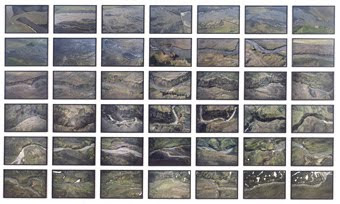
Eliasson is so much associated with the play of light and the participation of people that it's a surprise that the key to so much of his work comes in a room filled with five large scale photographic series. Aerial photographs of rivers and their surrounding landscapes, horizons or caves the photos are arranged, individually framed in black, in rows and columns. They are so different from the immersive abstraction of so many of the other works that their point appears clear. His work is real and solid, it is not about tricks and illusions but real lived sensation and emotion. Eliasson is fascinated by our sensory experience of the world we inhabit, how light and texture and space can be used to capture what it is to be human. This sets him light years away from dry formalism or glib concepts, his power comes from empathy.

The final room one arrives at houses the earliest work here, 'Beauty' a black space with a spray of water and a spotlight. At its most simple Eliasson has created a rainbow in the darkness but as beautiful as that might be the whole effect of the piece is far greater. As you move through the room the effects on light refracted through water changes but something far more powerful happens. The darkness and the room width line of mist seem to invite people to step in and through, and to laugh and talk, it's very un-gallerylike without feeling like a side show. It manages to be both contemplative and social, inside and out, dark and light. I like that Eliasson manages to create works that are so directly engaging. I have always studiously avoided talking about crowds and audiences in there reviews here but 'Take Your Time' positively demands it. From room to room strangers talked to one another, and they talked about the work, about how it felt without a hint of the classic art gallery whisper of "What's that all about then?"

Until now I had thought of Eliasson as a big event kind of artist, the danger of that sort of mis-conception is understandable when you encounter such splashy works as 'New York City Waterfalls' or Tate Modern's 'The Weather Project' through the media. That seems a deeply unfair view now, and I regret never having experienced those pieces. It might be that Olafur Eliasson restores a sense of wonder in that prism through which we see our world called art and in contrast to fashionable cynicism Eliasson's work is a sincere and democratic art. So much of this work is palpably generous in spirit, it invites people to interact without condescension. This is the essential exhibition in Sydney this summer and fall.

Thursday, 31 December 2009

On 2009 and all that


ArtKritique turns one year old today and whilst I have never been more excited about the future I can't help reflecting upon what I've learned. The blog you're reading now came about through an unformed and simmering frustration at the state of visual art and the way that people wrote about it, especially the way people wrote about it. As a modest collector and profligate reader I felt that art criticism bore such scant resemblance to how I experienced the arts, and as frustration is such a wasteful response decided to try to form an alternative that I imagined I would like to read.

There are two dominant strains of the virus: the pseudo-acedemic post structuralist theory based idea of criticism and the journalistic condescension of pleasantly rewritten press releases. It's infinitely rare for either of these schools to ever give one a sense of the visual experience of any given work or the mechanic between the visual and emotional or intellectual response. I've come to believe all the more firmly that if you're not doing either of these you're not writing about art, but using art to write about something else.
When I look to the work I responded to most strongly this year, Patricia Piccinini in Hobart, Intensely Dutch at the AGNSW, Tacita Dean at ACCA and Vernon Ah Kee all over the place, I see some common threads. It was richly layered and didn't give its secrets up easily, at the same time it needed no explanation or particular theoretical or contextual knowledge. Depth and opacity were never synonymous. In essence it was deeply human and the fact that it was quite so disparate made it all the more so. As someone who has been both voracious and discriminatory in all of my culture consumption I understand how being doctrinaire is much simpler than finding common currency and value. Our society suffers from the anxiety of quality together with the need for discrimination. We find the notion of universal values difficult and subsequently need to drop into the categorical. That's why it's easier to like sauvignon blanc and despise chardonnay, this year, than it is to find a common characteristic that we value across all wine. When that's applied to art we dismiss the old craft like ways, painting or sculpture, in favour of the abstract and conceptual. The flight from judgement is as weird as all hell, the craft or skill of an individual has almost been erased from our criteria for judging quality, in this privileging of the theoretical a self-defining supposed radical elite has removed a whole class from the potential benefits of art. That's as stupid as it is shameful.

Secret Stupid Art is based upon the admittedly banal observation that, just as empty vessels make the most noise, the works of art that claim to be the most intellectual are likely to be the dumbest. The urge to make art about art has always struck me as slightly dim, it's a bit like endlessly repeating a joke and one has to admit that Marcel Duchamp is subject to a rapidly diminishing law of returns. Conceptual art and its post-modern cousins scream as being based upon a colossal misapprehension: that art is, in and of itself, interesting. We all know that's not quite true, art is interesting because it is able to reflect, contest and explore the experience we have of being human.

Humanity is messy, complex, contradictory, brilliant and exquisite all at once and in a million different ways, that's why it's a subject that's so hard to master but so satisfying to attempt. Art is finite, academic and institutional, no wonder it's less satisfying. There is a lesson to be learnt from the cold hard formalism of Twentieth Century classical music, as composers work became more an more about the rules and history of composition thus their audiences became less and less engaged. Museum attendances suggest that the visual arts have not yet jumped this particular shark, however these also reflect a desire for a shared primary cultural experience which is different to an ideological affirmation. The ability of specific exhibitions to draw crowds still points to artists who engage in the human, the natural and the emotional as our preferred communicators.

I'm pretty firm in my belief that Samuel Beckett's 'Waiting for Godot' is the single greatest artistic achievement of the Twentieth Century. A play about the inability of language to carry the totality of human meaning just screams the absolute need that, despite everything, we must continue urgently violently to attempt to communicate. There pumps the absolute heart of why art is a human necessity and why humanity is an artistic imperative.

In 2009 I loved Linda Marrinon's sculptures and their Rembrandt dots of eyes as they formed themselves out of clay and bronze, Marc Standing's terror and beauty, Christine Eid's taxi driver anthropology and Marc de Jong's acute drawings. I discovered, late as an immigrant but that's a pleasure in itself, Mickey Allen's tender vision and Les Kossatz's compassionate surrealism. I loved the way a simple mark could be spastic and eloquent all at once. I loved the things that surprised me and I loved being surprised.

In 2010 I want to be moved to tears. I want to go back to see things because I can't get them out of my head, I want to see the world anew and see something deep and hidden in myself in the work of another.

Love, peace and happiness for 2010,
Jx

Friday, 18 December 2009

On Ben Frost @ Boutwell Draper Gallery


At which point did Pop Art become redundant as a commentary on both art and society?  I wish I had been able to experience both the nascent rush of early consumer society in the 1950s and the dazzle of an art that took it as both subject and form.  The strangest transformation that movement took was to become THE official art of the eighties and nineties, mixed with a little theory and low conceptualism Pop Art is the establishment.  Just ask Jeff Koons how he's holding up financially.  That might be why I shudder at the snarling kitsch of
Ben Frost's show 'Lost In The Supermarket' at Boutwell Draper.  It manages to be both pretentious and condescending while masked in the veneer of radical ugliness.

The best way to describe the work is as a series of high gloss painted collages of consumer logos, cartoon typography, manga sexuality.  It's hard on the eye and easy on the brain.  Each picture is dense with appropriated image, like the palimpsest of an angsty teenage collage.  It relies on staggeringly obvious juxtapositions and comes out as a less clever version of Adbuster's subversions of advertising.  On top of these accretions of commercial art come every street art cliché there are: aerosol tags, artful drips and stencilling.  If it were original it might be more interesting, if it were not so cynically tapping into so many vogueish styles it would just be laughable.

My biggest problem with the work is the implicit sneer at consumers.  The narcotic accumulation of images assumes a pretty high level of dumb receptiveness on the part of ordinary people.  You have to have a that low an opinion to be able to imagine that these dayglo explosions really represent the mental landscape of real people, either that or you have to be an artist.  My better half uses the phrase 'secret stupid' for people whose puddle like depth is hidden by confident rhetoric.  I now realise the war against Secret Stupid Art has been one of my key theme this year.  To be this stupid and grandiose an artist must need a breathtaking lack of insight.  

There.  I got that all out.  I've been avoiding ranting all year, but I've seen too much glib, dumb, lazy self-satisfied art that's been fluffed with Theory 101 that I can take no more.  Let's make 2010 the year of the War on Secret Stupid Art!


Wednesday, 16 December 2009

Del Kathryn Barton @ Kaliman Gallery


Sometimes in an exhibition you can find the most unlikely piece that allows you to see where an artist might have taken things.  Del Kathryn Barton's 'The Star Eat Your Body' is a restless exhibition that swerves between the familiar taken to a huge scale and the small but liberating thrash of experimentation.  The innate tension in Barton's work is between the big eyed graphic illustrative style, all fragile candy and a kind of tremulous sexuality that oozes out from bloodshot watercolours and direct stares.  As ever the most disturbing and rewarding work remains unresolved in that area.  Working along these borders is tricky, on either side lies something quite formulaic, to balance those trajectories takes something much more than just a formula.  That's why it's sometimes easy to find Barton's  work too cute to more than nibble at, whilst at other times we can be transfixed.

The two penis pieces demonstrate the dilemma most clearly.  In one series hung (and I really wanted to avoid that pun hazard) together six erects cocks are overprinted, in lush silver gelatin, with lace doilies.  The tiled effect looks like Gilbert & George, the medium like transgressive surrealist photography.  It's jarring in a kind of raised eyebrow way, and whilst there is a visual contrast between solid flesh and cobweb lace, between vertical and circular, it does scream 'look at how daring I am'.  

On the adjacent wall is a painted work, 'My Slow Body of Love' which, not that much more subtly, captures something far more interesting.  A phallic shape pushes up from the bottom of the frame and is engulfed in an intricate pattern, part cloud part vagina.  All of the visual echoes are direct and graphic, it's not coy, and yet the meaning is complex and opaque.  Barton captures sensation, the otherness of two bodies perhaps even transcendent sex.  It is vastly different from her other figurative work and yet seems like a natural progression, a contemplation of space and bodies.  She also makes it appear perfectly natural to assimilate some of the patterns and textures that feel familiar from aboriginal painting.  At her best she uses this to capture a sense of the blur between spirit and body, that effect of the physical and spiritual might be why aboriginal art can speak eloquently to us even when we have no sense of cultural meaning.  Its much to Barton's credit that this doesn't feel gratuitous.

The centrepiece of the show, a huge polyptych 'We too have been there, though we shall land no more' is a kind of stoner version of the Beethoven Secession frieze in Vienna.  The scale and scope make it a little bad made, which is endearing, but the grab bag of reference from David Cronenburg body horror, through star children and thylacines.  For all its incredible layers of detail it feels there's less here than meets the eye.  The manga plumbing and psychedelic washes and doodles seem to frame a piece where women, Barton's signature cow eyed and gaunt gamines, and nature are identified as having close simpatico, into this Garden of Eden come black serpents, a heavy metaphor for a maleness that's something less than benign.  It could give you a headache after a while.
There is a quality Barton's work that can be arresting, it might sit between the forensic linework and the gauzy colour, the neurotic detail and the big gesture, but it never quite ignites here.  For a show with quite so much exuberant penetration I felt oddly intact.   Del Kathryn Barton might be finding her future in these pictures, and that suspicion does make for interesting viewing, I just hope that the path chosen retains that ache of ambiguity and takes it somewhere surprising.